Photobucket Photobucket Photobucket Photobucket Photobucket Photobucket Photobucket Photobucket Photobucket Photobucket Photobucket Photobucket Photobucket

Before & After… Living Room Love

The Living Room is the heartbeat of the house, or, uh, is that the kitchen? Regardless, it is definitely an important room.

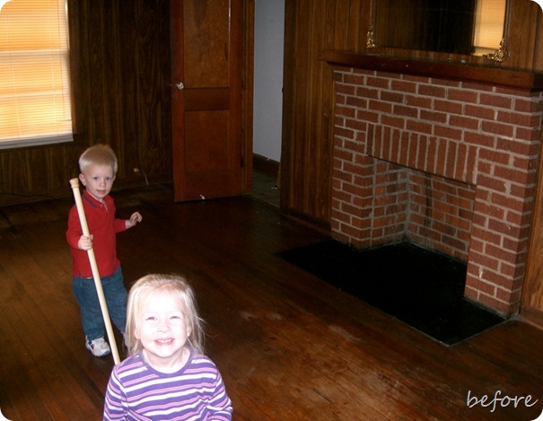
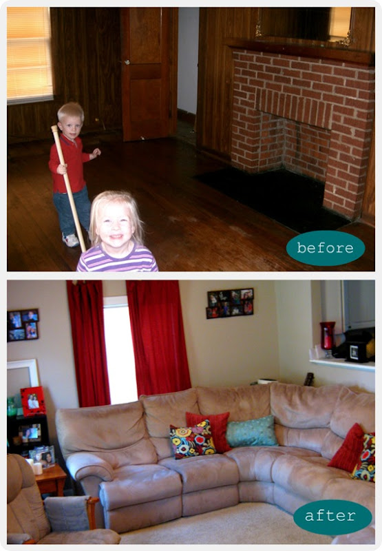
When we bought our place, the Living Room was not exactly what we had in mind as a cozy place for us to rest our little derrieres. 

One word that definitely came to mind was DARK, DARK, DARK. The walls and floors and doors were all a combo of gloomy and grungy darkness.

It’s a lovely narrow rectangle shape, which makes it hard to get a decent shot of the whole room, so here’s a view of one side… {See my little cutie and my nephew?  They are both SEVEN now!}  :(

The fireplace wasn’t functioning, so we reluctantly sacrificed it as well as the living room closet in order to gain a foot or so in the kitchen.

{Trust me. We needed it!} 

Living Room (couch side) - before

Chris is not a fan of hardwoods, and these weren’t in great shape anyway {as you can see} so carpet it was!


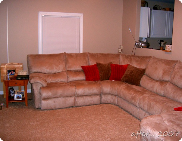
Our BIG AFTER…

Ah! The darkness is gone!

Living Room - After

I love the choice we made to put in a window between the kitchen and living room.  {See it up there?} With our small space, the window helps open things up and is very handy at aiding the room to room communicating! It also helps me keep track of Mr. SneakyPants Wade from time to time!


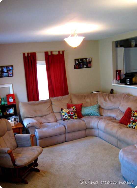
Here is how the room has evolved now…

IMG_2143

It has definitely come a very l o n g way.  


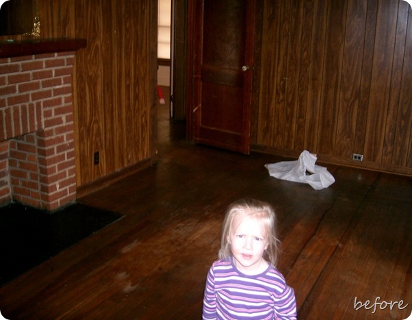
Here is the other side of our Living Room Rectangle *before* with my cute little model again… 

I miss that door!  Confining little ones with a door is a nice option, just in case you were wondering!

Living Room (TV side) - Before


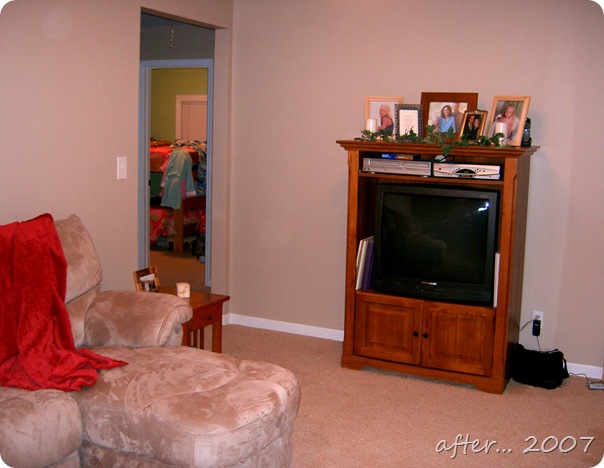
And the 2007 after, sans door…

CIMG1596


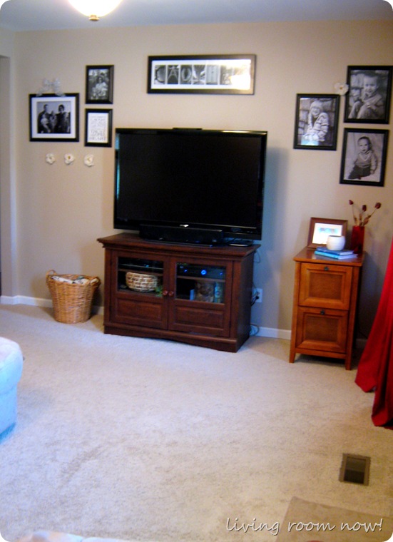
Here’s the Living room circa 2011!

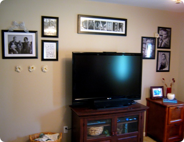
I just recently drastically updated this wall with my attempt at a gallery wall using some enlargements from Sam’s.  {Their enlargements are SOOO cheap. Seriously. I am not even kidding.}

Thanks to my photog sis once again. She is responsible for this entire wall minus the subway art.  :)

You can also see my new filing cabinet purchase earlier this year to keep my paper under control!

IMG_2128

I took some flowers I already had, cut off the stems and added some “interest” to the wall. 

I’m sure it’s breaking some sort of decorating “rule,” since I know one supposed BIG no-no is using faux flowers at all… but that’s okay.  I like it.  :)

You can see that the TV got a serious upgrade too…

IMG_2131


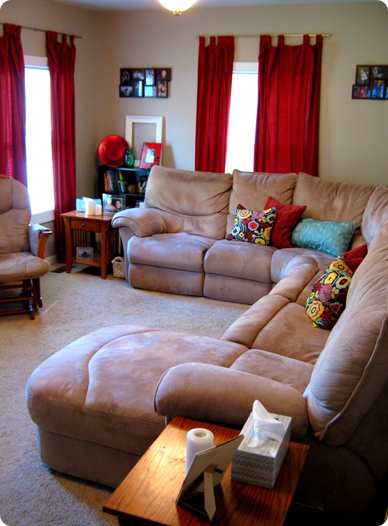
It may be small and weirdly rectangle shaped, but I have to say I love how our Living Room has come together in our four years here!

IMG_2150

It has definitely gotten sweeter with age!

And a final Before & After with a GREAT BIG shout out to my amazing hubby that made it happen…

LR B&A


Linking up to TDC’s Before & After Linky Party!

6 Responses to Before & After… Living Room Love
  1. Rachel
    April 15, 2011 | 6:33 pm

    Love it!! You did a great job!!

  2. Jessica
    April 15, 2011 | 10:14 pm

    I love the throw pillows; they are very cheerful!

  3. Renee
    April 18, 2011 | 12:13 pm

    Thanks! I think the pillows make the whole room look brighter somehow. :)

  4. Amee
    April 20, 2011 | 1:09 am

    Where did you get your floral throw pillows? I love them!

  5. Renee
    April 20, 2011 | 1:22 am

    Thanks! They are actually pillow covers that I bought from Etsy! The name of the fabric was alexander something I think…

  6. Amanda @ Serenity Now
    May 2, 2011 | 3:07 pm

    It looks so much better with the light walls! I like your curtain panels too. A huge difference!

    Visiting from Thrifty Decor Chick. Hope you'll stop by my blog to say hi. :)

Before & After… Living Room Love

The Living Room is the heartbeat of the house, or, uh, is that the kitchen? Regardless, it is definitely an important room.

When we bought our place, the Living Room was not exactly what we had in mind as a cozy place for us to rest our little derrieres. 

One word that definitely came to mind was DARK, DARK, DARK. The walls and floors and doors were all a combo of gloomy and grungy darkness.

It’s a lovely narrow rectangle shape, which makes it hard to get a decent shot of the whole room, so here’s a view of one side… {See my little cutie and my nephew?  They are both SEVEN now!}  :(

The fireplace wasn’t functioning, so we reluctantly sacrificed it as well as the living room closet in order to gain a foot or so in the kitchen.

{Trust me. We needed it!} 

Living Room (couch side) - before

Chris is not a fan of hardwoods, and these weren’t in great shape anyway {as you can see} so carpet it was!


Our BIG AFTER…

Ah! The darkness is gone!

Living Room - After

I love the choice we made to put in a window between the kitchen and living room.  {See it up there?} With our small space, the window helps open things up and is very handy at aiding the room to room communicating! It also helps me keep track of Mr. SneakyPants Wade from time to time!


Here is how the room has evolved now…

IMG_2143

It has definitely come a very l o n g way.  


Here is the other side of our Living Room Rectangle *before* with my cute little model again… 

I miss that door!  Confining little ones with a door is a nice option, just in case you were wondering!

Living Room (TV side) - Before


And the 2007 after, sans door…

CIMG1596


Here’s the Living room circa 2011!

I just recently drastically updated this wall with my attempt at a gallery wall using some enlargements from Sam’s.  {Their enlargements are SOOO cheap. Seriously. I am not even kidding.}

Thanks to my photog sis once again. She is responsible for this entire wall minus the subway art.  :)

You can also see my new filing cabinet purchase earlier this year to keep my paper under control!

IMG_2128

I took some flowers I already had, cut off the stems and added some “interest” to the wall. 

I’m sure it’s breaking some sort of decorating “rule,” since I know one supposed BIG no-no is using faux flowers at all… but that’s okay.  I like it.  :)

You can see that the TV got a serious upgrade too…

IMG_2131


It may be small and weirdly rectangle shaped, but I have to say I love how our Living Room has come together in our four years here!

IMG_2150

It has definitely gotten sweeter with age!

And a final Before & After with a GREAT BIG shout out to my amazing hubby that made it happen…

LR B&A


Linking up to TDC’s Before & After Linky Party!

6 Responses to Before & After… Living Room Love
  1. Rachel
    April 15, 2011 | 6:33 pm

    Love it!! You did a great job!!

  2. Jessica
    April 15, 2011 | 10:14 pm

    I love the throw pillows; they are very cheerful!

  3. Renee
    April 18, 2011 | 12:13 pm

    Thanks! I think the pillows make the whole room look brighter somehow. :)

  4. Amee
    April 20, 2011 | 1:09 am

    Where did you get your floral throw pillows? I love them!

  5. Renee
    April 20, 2011 | 1:22 am

    Thanks! They are actually pillow covers that I bought from Etsy! The name of the fabric was alexander something I think…

  6. Amanda @ Serenity Now
    May 2, 2011 | 3:07 pm

    It looks so much better with the light walls! I like your curtain panels too. A huge difference!

    Visiting from Thrifty Decor Chick. Hope you'll stop by my blog to say hi. :)