It’s 11-11-11, baby!! How totally rad is that? Doesn’t it make you want to do something totally memorable today? :)
Welcome to PART 4 of our Beautify your Blog, DIY style Series! Make sure you catch up on…
This series has just been SO much fun for me. I am seriously addicted to the constant tweaking and blog beautification. I love learning and sharing all my NEW knowledge, so this is a WIN WIN for me. :)
Today’s topic may be a BIG breakthrough for you. For me it was one of those light bulb moments.
A few months ago, I happened across someone sharing some free sample sidebar title images… things like “About me,” “Followers,” “Links,” etc. I wanted to use them, but I couldn’t because I needed more titles than what was included. BUT… even better than the free sidebar samples were the instructions to save the image to my computer and upload to my blog as a picture.
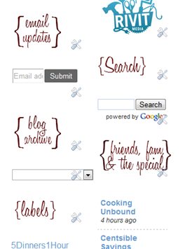
All of a sudden, I was like, DUH! I can just create my own personalized, CUSTOMIZED Sidebar Titles as a graphic in pixlr and add it as a picture gadget!!! How easy is that??!!
The possibilities are ENDLESS when we have the ability to tweak our blog OURSELVES!! We can pick the font we want, the color, the size, AND we can apply the adding graphic tips from last week and even add graphics!
First up going from a DRAB to FAB Sidebar is…
Step 1… Decide if you want a transparent background or a patterned background. If you want a pattern, make sure to coordinate it with your overall blog theme colors and design. If you have a detailed background on your blog, you may not want a patterned sidebar title since it may get a bit “busy.”
Tip… To grab a snippet of your blog background or header to use as your sidebar background, use snipping tool or do print screen and paste it into paint.net and crop.
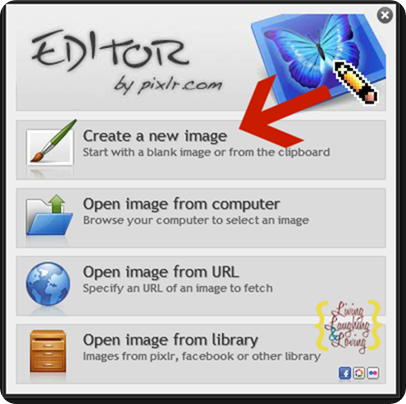
Step 2… Open Pixlr.com. Choose Create New Image if you are using a transparent background or Open Image if you are using a patterned background.
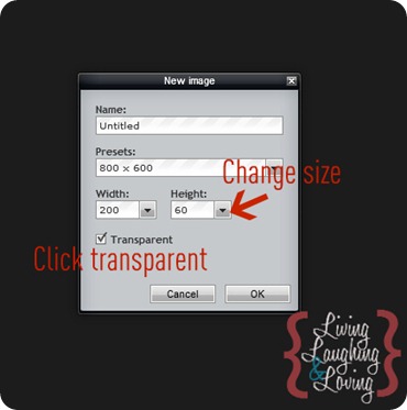
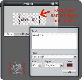
Step 3… Decide your Sidebar Title Size. This will take some trial and error. In blogger, go to Design, Template Designer, Adjust Widths. {This is a SUPER easy way to change your blog width. In my opinion, the blog post area should be at least 600 pixels or so.} Look at your sidebar width number and subtract 10 or so. That is how wide we want our Titles to be.
Your title height is up to you. I would start with around 60 or so.
Step 4… Click “A” and choose your fabulous font and color. Think about what your LONGEST Title will be and start with that one so you’ll know your font size will work for that one. Use the gray and white checkered boxes to help you keep all your text at the same height.
Remember to look at the color number code up at the top. You’ll need to type this in on all your titles so your colors will match.
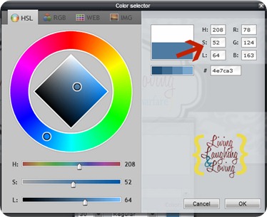
Step 5… If you want to add curly parentheses around your title like mine, make a separate text box for each side of the parentheses and make the font big enough to overlap your text. You may want to try a few different fonts to find the one with the best looking one. You could also choose a different color to make your text contrast with your parentheses.
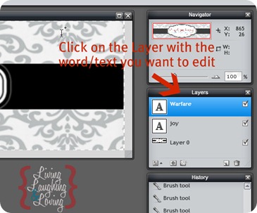
Remember the tip to move back and forth between text boxes?
Click over to the right on Layers. Click on the layer you wan to move or edit. Then go back to your image and click on that text.
Don’t crop to fit… Keep your text centered on your canvas.
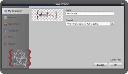
Step 6… Save as a png. Remember where you saved it, and DON’T close. Once you’ve closed it and reopened you can’t edit it, and you’ll have to start from scratch for the rest of your titles.
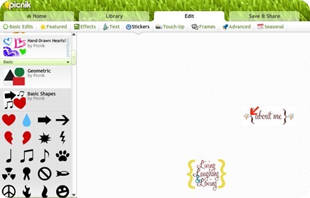
Step 7… If you want to add a graphic, upload to picnik and follow the instructions from Part 3.
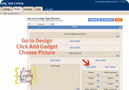
Step 8… Add titles to Blogger. Go to Design, Add a Gadget, and Picture.
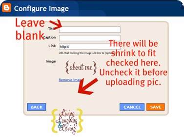
Make sure you leave your title blank. This does make it tricky when you are moving things around since all your titles will all be named “Picture,” but hey, it works. :) Make sure to unclick “Shrink to fit.” Hit Save. and check your result.
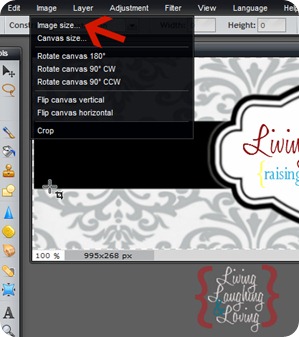
If it’s too big or too small, go back to Pixlr and adjust the size by clicking Image and then Image Size.
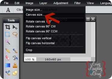
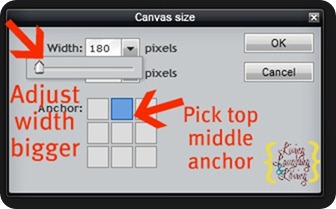
If it’s not centered well, you’ll need to add some white space in the needed area. Go back to Pixlr and click Image, Canvas Size.
Click in the top middle box as your anchor and add a bit to your width pixels. Save and try that one out. This one will take some trial and error of adding white space on one side and/or cropping white space on another side to get how you want it.
Step 9… Once you’ve got your first Title squared away and looking centered how you want it, go back to Pixlr and make the rest of your awesome Titles. Don’t start from scratch! Just backspace, type in your new text and repeat the above steps.
It’s VERY important that you don’t crop your titles to fit. Once you’ve determined the right image and canvas size of your first Title, you’ve gotta keep ‘em ALL that size. Otherwise, your blog sidebar will be full of Titles that are all varying sizes. Uh, not cool! You don’t want a smaller word like “Links” to be HUGE while something longer like “Search my Blog” to be teeny. They should be uniform… which is hard to do when we’re creating them like we are.
That’s why we started with our longest Title first, so we don’t end up having to get smaller as we go.
Step 10… Save each title and upload to blogger as a picture gadget. Don’t forget to go into each sidebar element and delete the old school Title.
Wala! Ten easy steps to go from a Drab to Fab Sidebar!!
Who would’ve thought we could do that ourselves, right??
I’m REALLY, REALLY close to giving in to revamping MY sidebar titles, since I made these at the very beginning of my Pixlr knowledge. :) So keep your eyes peeled from some improvement coming soon.
Remember the name of the DIY Blog Design Game is good, old TRIAL & ERROR, baby!!
You can do it!!
Stay tuned! Lots more Bloggy DIY goodness to come!!!
::Sometimes I link to Weekend Bloggy Link up, Tatertots & Jello, House of Hepworths, Delightful Order, Bowl Full of Lemons,Organize & Decorate Everything, This Chick Cooks, Funky Junk Interiors, Craft Envy, Reasons to Skip the Housework, Somewhat Simple, Shabby Creek Cottage, No Minimalist Here, Skip to my Lou, Fingerprints on the Fridge, CRAFT,Today’s Creative Blog, and Someday Crafts. You should check ‘em out!!::












I'm so excited to have found this from Serenity Now Link party!! I have been wanting to redo my site and I finally have some ideas but didn't know what to do. Thanks so much for sharing!!! Can't wait to read them all!
I am really loving this series! I haven't had the chance to sit down and make some changes to my blog, but it's coming! Your step by step instructions will make it so easy. I never thought I'd be able to do these things myself! Thanks so much!
Love this series. Thanks for taking the time to figure these things out and then share. I think I see better sidebar titles in my near future – ha!
Ugh, another wonderful tip, and I still haven't had the chance to work on my header yet! I am loving this series. I hate spending all the time to figure it all out, and you put it in such easy concise steps. Thank You! :)
Stopping over from Serenity Now….I'm so glad I clicked on your link. I have been wanting to make some changes to my blog and these directions are great. Can't wait to find the time to make changes on my blog. Thanks for sharing…very sweet of you. Have a great day! :)
Perfect, I was just wondering about this!
This is awesome Renee! Hoping to do this very soon!
Thanks Renee! Stopping by from Serenity Now…
This is awesome! Thank you!
I have been referring and re referring myself here. Thanks so much! It's super helpful.:)
Thanks for sharing! This is great! I pinned it. :)
Great idea! I just started making my own.. Ive done one. hehe. Also, I would love for you to share this at my friday link party. Its new so I would love to have you link up :)
Thanks, I revamped my sidebar due to your help. Lots more to fix, but it's great that people like you share!
Boy did I need this! thank so much!!
This looks really awesome I am going to have to try this soon! Thanks for the info.
http://www.mun-emakingblogs.blogspot.com
You have just been featured at
http://www.mun-emakingblogs.blogspot.com
Please come by and grab my button! Thanks!
I am going to have to give this a try. Thanks for all of the tips!
Glad to have found this! I always appreciate blogging and blog design tips. Thanks for sharing it with us!
I want to just say "thank you" for doing this for so many who just need the correct instructions. Unfortunately, I'm so computer illiterate, you lost me at "…graphic in pixlr and add it as a picture gadget!!! How easy is that??!!" Ummm….what pixlr? Ha! I'm sure these directions are simple for everyone else and I so appreciate you doing this for everyone. I think I better find a "Blogging for Dummies" book! Ha! Hope I gave you a giggle. Happy Blogging!
Thank you, thank you, thank you! I'm going to have to check out the other parts of this series! Crafts and DIY come naturally to me, but designing with technology is a real learning curve at the moment!
–Katie
http://www.blah2beautiful.blogspot.com
Creatively Living Outside the Box
Thanks everyone!! SO glad it is helpful!! I love sharing this stuff, lol!!
Joy, pixlr is a website you create the graphic in. You can click on the link above to get there.
Then in blogger, you go to Design, and then click where it says "add a gadget" and choose "picture."
Sorry it wasn't clear, but thanks for the humor!! :)
this is great, I really need to get better at this stuff I'd love for you to add this to my link party over at http://raegunwear.blogspot.com
Thanks for sharing! I'm hoping to find time to play with this for both of my blogs over the holidays. I pinned it so I wouldn't lose it! (BTW, saw you over on the linky party at Organize and Decorate Everything (organizeyourstuffnow.com).
Great information and I have enjoyed your Beautify Your Blog series. Thanks for sharing this at the Open House Party.
xo,
Sherry
Pretty good post. I just stumbled upon your blog and wanted to say that I have really enjoyed reading your blog posts.Any way I'll be subscribing to your feed and I hope you post again soon.Lip Fusion
Woo-hoo!! Finally did it! Two months later – not too bad, right?! :) Took a couple hours to make it right, but once you get the hang of it, not too bad!
I've just found your blog and loving all the tips for my own blog. I *just* started using picnik.com YESTERDAY when I found a tutorial on how to make those awesome subway art printables. Who knew it could be so easy. And then today, in horror I read that they are closing the picnik site!!! ACK!!! What now??? :(
I am loving this series! I just made a signature via your directions and now I will work on my sidebar titles! Thank you SO MUCH!!
Wahoo! Thanks you, got my side bar titles done :-) Off to check out my nab bar now… I can't say thank you enough, I would never have figured this out without all of your really great directions! Sharing the knowledge= awesome!
Hi! thanx so much for sharing all these tips, I´ve found them very useful! I just gotta question…how can I get a customized font on pixrl? I love the font u are using, but when I haven’t found it in Pixlr…i have honey script or something in my PC (I downloaded it and installed it…but it´s not showing in Pixlr…can u please help me? thanks in advance!
Loving your DIY blogger design tutorials! Working on updating my sidebar titles now…
Hi Renee…HA my second comment in like two seconds, sorry! So I just made my new sidebar titles and apparently Blogger no longer lets you leave the title bar blank in any gadget in the new Blogger interface. I did some research and learned a way to solve the problem. In the title bar enter the following code:
[source: http://www.betatemplates.com/2010/06/blank-title-field-in-blogger-gadgets.html%5D
It worked for me! Didn’t know if this issue had been brought to your attention, thought maybe you’d want to add an update to your tutorial :]
xoxo,
marci
AH sorry, duh because I entered the code it made it actually go through AS a code! See the linked post for the actual code…I’m not sure how to paste it without it going through AS a code.
This is a great tutorial, however, when I go to upload my png file to Blogger, it turns the background black instead of just leaving it white (like it is saved on my computer). HELP! Am I missing something?
Do you know how to get rid of the image border when doing this?