Isn’t it funny how much blogging can change over the years? Who would have thought we would be talking about facebook pages for our blogs??
But Facebook is so huge now. Everybody and their grandmother is on there. They think they will hit 1 BILLION users by this August! ONE BILLION! That is a LOT of potential blog readers, right? And lots of those almost a billion people check it every day… multiple times a day.
Utilizing facebook is a post in and of itself, but one great way to try to convert visitors to “likers” is creating a landing page for visitors to “land” on and really WOW them in those first few moments.
Landing Pages are super cool, but they usually require some uber techy skills that are pretty complicated, I think.
Enter… Pagemodo! Pagemodo offers templates to create an easy landing page for FREE!
Now, you may be thinking, “Didn’t the new facebook timeline KILL landing pages?”
Well, yes… and no. Keep reading, and I will dish on the ‘duh answer’ around that problem. :)
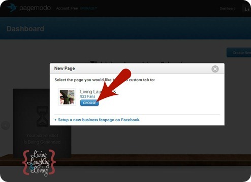
Step 1… Log into Pagemodo and choose which fan page you want to create a Landing Page for.
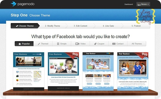
Step 2… Select which Page Template you’d like.
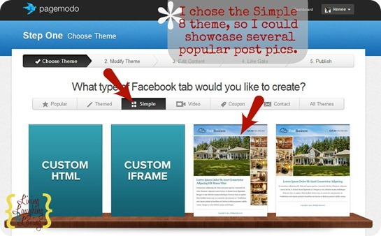
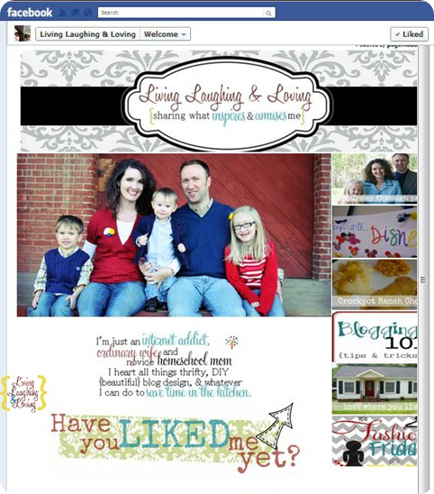
I picked from the Simple Tab, a template called something like Simple 8. I liked this one because it had a place to feature 8 pics… 2 large and 6 small.
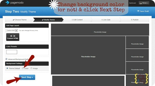
Step 3… Change Background color if you wanna, then click next step.
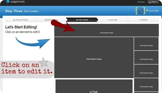
Step 4… Click each element to upload an image or customize.
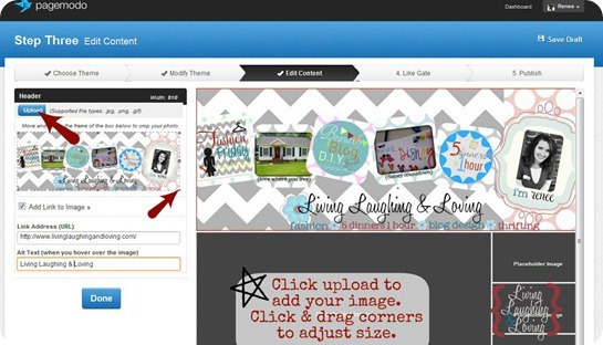
Step 5… Click upload and select your image. Click and drag the corners of the box to adjust.
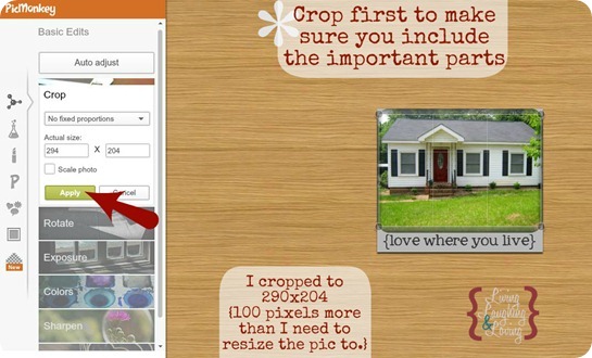
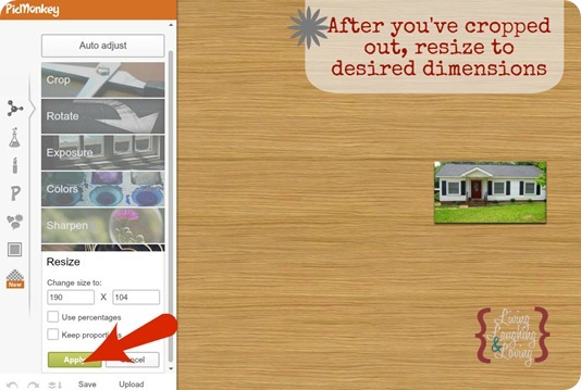
Step 6… Upload the pics you’re using to picmonkey {or another photo editing site} and crop to fit first. Pagemodo gives you the picture dimensions. Just go to “crop” or “resize” in picmonkey and adjust it. I had a major fit with this part both times. It’s a bit tricky. For the Simple Eight Template that I chose, the dimension size for the small images was 190×104, but when I uploaded that size it would cut off the bottom where my title was. I tried several different remedies, but what ended up working the best was resizing to 190×104 and making sure that the title and important parts of the image were toward the middle since the edges were getting cut off by pagemodo.
I didn’t have this issue with the two bigger images… just the smaller ones.
Before you resize to 190×104, resize to within the 200 or 300 range. Then crop it to 290×204 so you can do your best to keep the important parts in the crop.
Then click on resize and resize to 190×104.
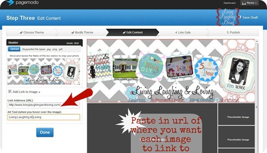
Step 7… Check the box to link your image up. I love this feature because this means you can use this landing page to showcase your favorite posts! Just upload your images from your top posts and paste the links in the pop up boxes.
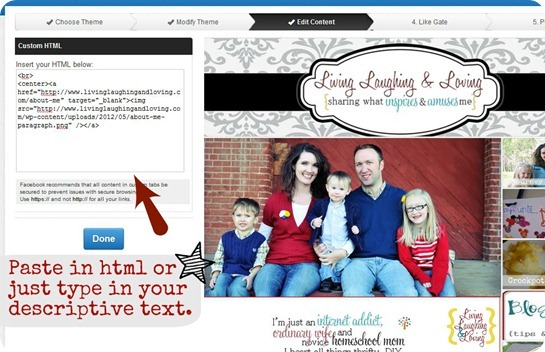
Step 8… Add a bit of text or html in the html section. I created a text paragraph graphic and then uploaded it to be hosted on my blog so I could get the html code. You can do this on blogger as well, or upload it to photobucket.
If you don’t want to do html, you can just type text right in the html box.
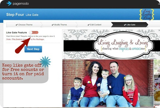
Step 9… Click Next and either skip the like gate or upgrade to the pro package to offer an incentive for people to click like.
You can still offer an incentive without this, of course, you just can’t REQUIRE it.
Pagemodo will make it where the incentive or freebie is only available after they have clicked like. With the free account, you can offer the freebie, but it will be available to anyone whether they actually click like or not.
The advantage to still trying to offer the freebie is in luring them from your blog to your facebook page… ie, “Like me on facebook and receive my awesome ebook or printable as thanks.”
That gets them ON your facebook page… a whole lot closer to clicking “like” than they might have been otherwise. :)
I’d like to eventually create an incentive to liking my page, but for now I’m just sticking with a plain old call to action. Make sure you do too. Somewhere on that landing page, simply ASK people to like your page.
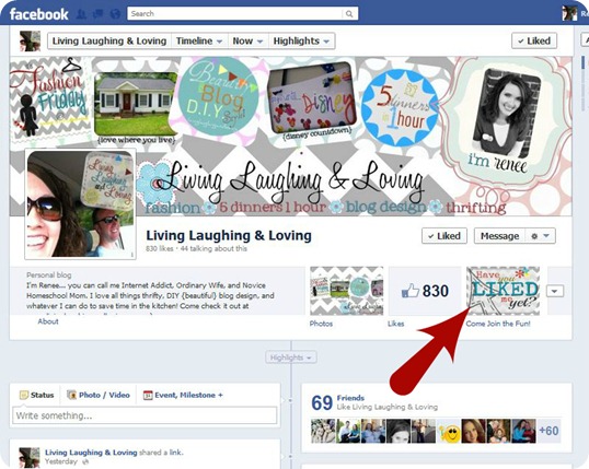
Try something like… “Like me please” or “Click Like to join in the fun” or “Have you liked me yet?”
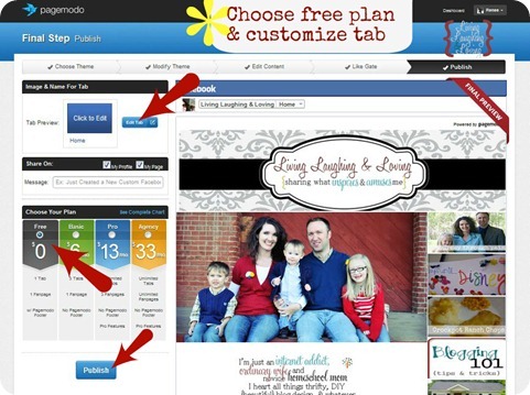
Step 10… Click the free plan and customize your tab. For now we can just change the color and the title.
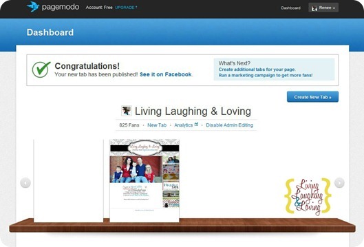
Unfortunately, they force us to share the pagemodo dealio on facebook in order for it to publish, so don’t forget that. A couple of you noticed my post the other night. :)
All right! Now it’s time to celebrate! We did it!
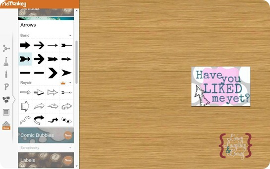
Step 11… Create an image for your tab. This is extra, but I think if you’ve taken the time to create a fabulous landing page than you should go ahead and make a fabulous tab image. :) If you’re really pressed for time and can’t manage, you could always use your blog button. It probably won’t fit the space, but it can be good enough for the moment.
Your tab image should be 111×74. You can use picmonkey or picasa or whatever site you prefer. If you are at a loss for where to begin, just start by tying in the colors of your timeline cover since that is what it will be under.
You can choose to say “Welcome” or “Home” or even use it as another chance for a “Call to Action.” I didn’t see anywhere in the rules where a call to action in the tab image is forbidden, but who knows, so someone please let me know if I’m wrong.
Step 12… Add the image to make your custom tab. You can follow these instructions from Pagemodo. Once you’ve uploaded it, it won’t look like it worked, but check your fan page in another tab or window and it should be there.
Woowhee! Now we are almost done!
This fabulous landing page will only be seen when someone clicks on your Tab. For some reason facebook decided you can no longer set your landing page as your default screen.
BUT… some genius somewhere put two and two together and realized that all is not lost with facebook’s attempted death of the landing page.
HERE’S THE LANDING PAGE SCOOP…
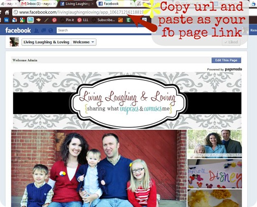
We can actually control where a user lands by copying and pasting the specific url of our landing page and using that as our facebook link when we are sharing our page somewhere.
So if you have a facebook social icon on your sidebar {and you SHOULD!} just modify the link from facebook.com/pagename to whatever url you’ll see in the address bar when you are on your landing page.
Easy, right? :)
I know you all can create some amazing masterpiece landing pages that will be sure to attract lots of great likes!
|
Remember starting from step one on a blog can be really overwhelming, but if you take baby steps and work on one little thing at a time, then gradually you’ll realize that you are on your way to making your blog beautiful… all by yourself. Here’s the other topics we’ve already covered… |
Make sure you stay tuned for more blog beautifying coming up! I would LOVE to see your awesome landing pages too, so make sure you let me know so I can check it out!
And I can’t do all this talk about facebook fan pages and NOT ask you to hop over and like me, can I? :)
*Sometimes I link up at these parties… Weekend Bloggy Link up, Tatertots & Jello, House of Hepworths,Bowl Full of Lemons,Organize & Decorate Everything, Not Just a Housewife, Funky Junk Interiors, Shabby Creek Cottage, Skip to my Lou,Today’s Creative Blog, the 36th Avenue, Thrifty Décor Chick, Home Stories A-Z, Five Days Five Ways, How to Nest for Less,Positively Splendid, Six Sisters Stuff, and Someday Crafts. You should check ‘em out!!













Wow, great timing! I’ve posted about Facebook for bloggers too today and so I’ve got your post linked to it – thanks!
You have no idea how helpful this post has been (and will continue to be) for me (and MANY others I’m sure)! I am to say the least tech impaired and thought the only way to get some cute custom Social networking buttons and such was to pay someone boku bucks to do it for me. This is just wonderful can’t thank you enough for all the step by steps.
Amy*
WOW that was intense but so awesome!!! Your instructions (like always) are FABULOUS!!
Thank you!! <3
Megan
Really great post. Very timely and helpful. I followed your directions for our FB page and it worked like a charm. Once you get past the picture cropping bit, the rest is easy!
Thanks!
Jonathan Sarr
This is great information!!! I am a new reader, creating over at http://twelveoeight.blogspot.com
Tanya :)
This is great information!! We’re so glad you linked up to our “Strut Your Stuff Saturday.” Thanks for coming and we hope you’ll be back. -The Sisters
This is a great tutorial. I’d love to have you come over and link this up on my linky party.
http://cornerstoneconfessions.com
I the meantime I’m going to be working on my own Facebook landing page. Thanks!
Kathy
I’m still fairly new at blogging. I love great tutorial’s like this to help me out :)
Awesome tutorial!
Your newest Follower!
Mrs. Delightful
http://www.ourdelightfulhome.blogspot.com
I love this series! Your directions are so clear and easy to follow. I was able to create my page and pass your link on to a friend. Thanks again for sharing all of your creative skills!
I already like you. :D BUT I JUST FINISHED DOING MY LANDING PAGE AND CUSTOM TAB AND HAD TO LET YOU KNOW!!!!!!!!!!!!!!!!!!!!!!!!!!!!!!!!!!!!!!!!!!!!!!!!!!!!!!!!!!!!!!!!!!!!!!!!!!!!!!!!!!!!!!!!!!!!!!!!!!!!!!!!!!!!!!!!!!!!!!!!!!!!! Those exclamation marks are not equal to my excitement.
Gonna start with this soon. I’ve got to tell you, it seems a little daunting, especially since I’m not a real Facebook lover, but I know it’ll be a great asset for my blog. Thanks, Renee.