Photobucket Photobucket Photobucket Photobucket Photobucket Photobucket Photobucket Photobucket Photobucket Photobucket Photobucket Photobucket Photobucket

Above the Cabinet De-Basket-fying!

So for some reason, all of a sudden I got inspired to redo the tops of my cabinets.  My goal was basically to de-basket-fy everything. Don’t get me wrong.  I am a lover of baskets, but I wanted a different and more contemporary look.  We moved in here January of ‘07, and I’m pretty sure that I haven’t updated it since. 
I’ve been reading home decor blogs since about November of last year, and they have definitely been an inspiration.  I guess it has been mostly an inward inspiration since I haven’t taken on very many projects since Christmas.  :)
The fun and challenging part of the project was that I didn’t make ANY new purchases!  (Not to say that I won’t, hunny!)  The mood struck me one night, and I tackled it the next day during one of my most favorite times of the day… NAP TIME!  I reused some things and just shopped other rooms of the house for the rest.  Some were actually just dishes in the cabinet that I thought were pretty enough to display.
It was very interesting task to accomplish for sure with my belly sticking out… hindering all my leaning and reaching effects.  All in all, I think I am happy with it, though I’d like to pick up a few more things for some finishing touches…
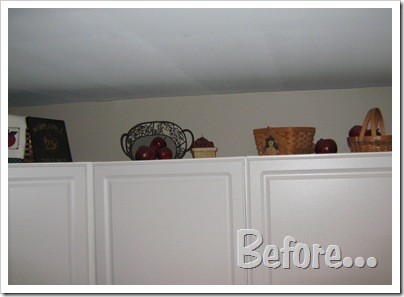
IMG_0675

Look at all the baskets… kind of a “country” look? Yes, that is a scarecrow basket.  It’s supposed to be turned to the other side to hide the scarecrow, but well, it’s been like this for a “hot five.” I’ll blame it on Chris.  :)

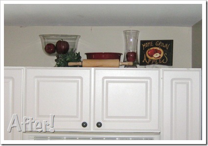
IMG_0683

And, wala!  No more baskets! I think it still has a country feel, but more of a shabby chic country.  :)
I tried to find some tips or pictures online to get me started, and some advice I read was…
1) Group things together.
2) Make sure to leave empty spaces for the eye to rest on. 
I’ve also heard the “groups of three” rule though I didn’t necessarily follow that one…
IMG_0676

This set is a good example of the grouping rule.  I think the grouping looks soooo much better than the random items evenly spaced out.  What do you think?

IMG_0681
I did a lot of stacking things on top of things to make them taller and more visible, or just in a better proportion to the other items in the group.  My clear pyrex bowls made fairly good and fairly unnoticeable stackers.
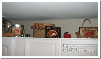
  

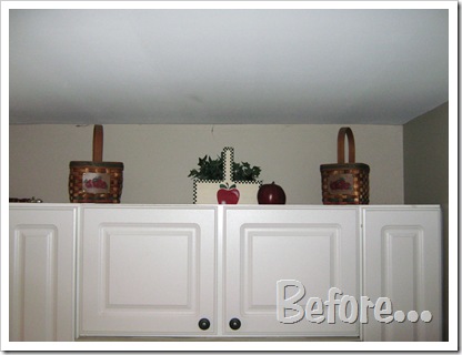
IMG_0677

Isn’t that basket overload???  Looking at it now, I think it’s just too many things in too small of a space.
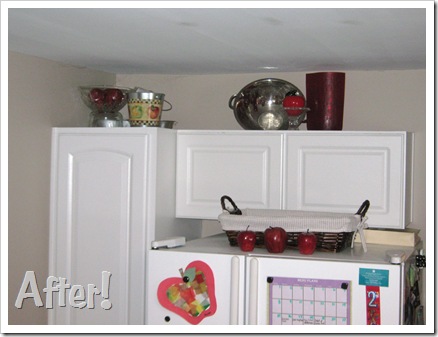
IMG_0680

I’m sorry.  I confess. I didn’t show you what the top of the fridge did look like. That’s why my “before” pic is cropped so high.  :) It was not pretty, for sure.  Just imagine lots of clutter and papers piling out of that basket.  
I’d like to add something to this section, but that may have to wait until I can make a run to the Dollar Store or Hobby Lobby to see what they have for cheap!
So that’s it!  An above the cabinet redo for Zippo!  Can’t beat that!
Too bad while I was accomplishing all that cheap inspiration, the Wadester was in fact, NOT napping, but was instead wreaking havoc with MARKERS for yet the THIRD time.  Nice.

Linking to…

Making

2 Responses to Above the Cabinet De-Basket-fying!
  1. Carrie
    September 6, 2010 | 10:06 pm

    "For some reason …"

    You are NESTING, Girlfriend!! ;)

    Looks great!

  2. Holly @ Roller Coaster Life
    September 13, 2010 | 10:41 pm

    looks fantastic!! I am just now starting to decorate up there!

Above the Cabinet De-Basket-fying!

So for some reason, all of a sudden I got inspired to redo the tops of my cabinets.  My goal was basically to de-basket-fy everything. Don’t get me wrong.  I am a lover of baskets, but I wanted a different and more contemporary look.  We moved in here January of ‘07, and I’m pretty sure that I haven’t updated it since. 
I’ve been reading home decor blogs since about November of last year, and they have definitely been an inspiration.  I guess it has been mostly an inward inspiration since I haven’t taken on very many projects since Christmas.  :)
The fun and challenging part of the project was that I didn’t make ANY new purchases!  (Not to say that I won’t, hunny!)  The mood struck me one night, and I tackled it the next day during one of my most favorite times of the day… NAP TIME!  I reused some things and just shopped other rooms of the house for the rest.  Some were actually just dishes in the cabinet that I thought were pretty enough to display.
It was very interesting task to accomplish for sure with my belly sticking out… hindering all my leaning and reaching effects.  All in all, I think I am happy with it, though I’d like to pick up a few more things for some finishing touches…

IMG_0675

Look at all the baskets… kind of a “country” look? Yes, that is a scarecrow basket.  It’s supposed to be turned to the other side to hide the scarecrow, but well, it’s been like this for a “hot five.” I’ll blame it on Chris.  :)

IMG_0683

And, wala!  No more baskets! I think it still has a country feel, but more of a shabby chic country.  :)
I tried to find some tips or pictures online to get me started, and some advice I read was…
1) Group things together.
2) Make sure to leave empty spaces for the eye to rest on. 
I’ve also heard the “groups of three” rule though I didn’t necessarily follow that one…

IMG_0676

This set is a good example of the grouping rule.  I think the grouping looks soooo much better than the random items evenly spaced out.  What do you think?

IMG_0681
I did a lot of stacking things on top of things to make them taller and more visible, or just in a better proportion to the other items in the group.  My clear pyrex bowls made fairly good and fairly unnoticeable stackers.
  

IMG_0677

Isn’t that basket overload???  Looking at it now, I think it’s just too many things in too small of a space.

IMG_0680

I’m sorry.  I confess. I didn’t show you what the top of the fridge did look like. That’s why my “before” pic is cropped so high.  :) It was not pretty, for sure.  Just imagine lots of clutter and papers piling out of that basket.  
I’d like to add something to this section, but that may have to wait until I can make a run to the Dollar Store or Hobby Lobby to see what they have for cheap!
So that’s it!  An above the cabinet redo for Zippo!  Can’t beat that!
Too bad while I was accomplishing all that cheap inspiration, the Wadester was in fact, NOT napping, but was instead wreaking havoc with MARKERS for yet the THIRD time.  Nice.

Linking to…

Making

2 Responses to Above the Cabinet De-Basket-fying!
  1. Carrie
    September 6, 2010 | 10:06 pm

    "For some reason …"

    You are NESTING, Girlfriend!! ;)

    Looks great!

  2. Holly @ Roller Coaster Life
    September 13, 2010 | 10:41 pm

    looks fantastic!! I am just now starting to decorate up there!